


My Favourite Middlesbrough Football Kits
Posted on 21/07/21
What colour do Middlesbrough play in? Well, red of course, usually with a dash (or more) of white thrown in. However, the club’s formation back in 1876 saw them start with blue and white until just before the turn of the 20th century, when the red and white combinations started to appear. Blue did make a comeback in 1994, appearing until 2001 in various forms on home shirts (with further comebacks in 2016, 2019 and last year)
The debate among Boro fans these days tends to be around the presence of the ‘white band’ across the chest/mid-riff, and whether it’s absolutely critical that it appears. Some aren’t so fussed, some are staunchly opposed to anything but, which I’ve always found strange given it’s only been a thing since Jack Charlton introduced it upon his arrival as boss in 1973. He later disclosed the white band was added to the shirts “to help the players identify each other better on the pitch” – so merely a functional design rather than a nod to nostalgia. That said, it’s since took on a life of its own, and is now clearly something that makes us identifiable among the sea of red shirts we see across the other 91 league clubs (though none of my top five kits feature it).
Home kits are always accompanied by white shorts with red detail or vice versa, and sporadically with a small splash of blue.
Away kits have seen us adopt many weird and wonderful combinations. The 1994/95 two tone green with gold(ish) stripes divided opinion on its release, and still does to this day. There’s been an Argentina style effort, a couple of black and white offerings (the 2000/01 featured some black and white stripes, too close to Newcastle for some), but mainly we see blue in various shades, with the odd white one too.
Third/limited edition kits when released tend to be white with recent releases in the last decade, first with Adidas and more recently with Hummel, going down a treat.
When I was asked by Vintage Football Shirts to pick my five favourites I originally thought it’d be almost impossible, but in actual fact it wasn’t that difficult. Not because we’ve had so many terrible ones, because we haven’t, but more to do with the five I’ve chosen being THAT good.
Here they are.
Middlesbrough 1988-90 Home Shirt by Skill Leisurewear
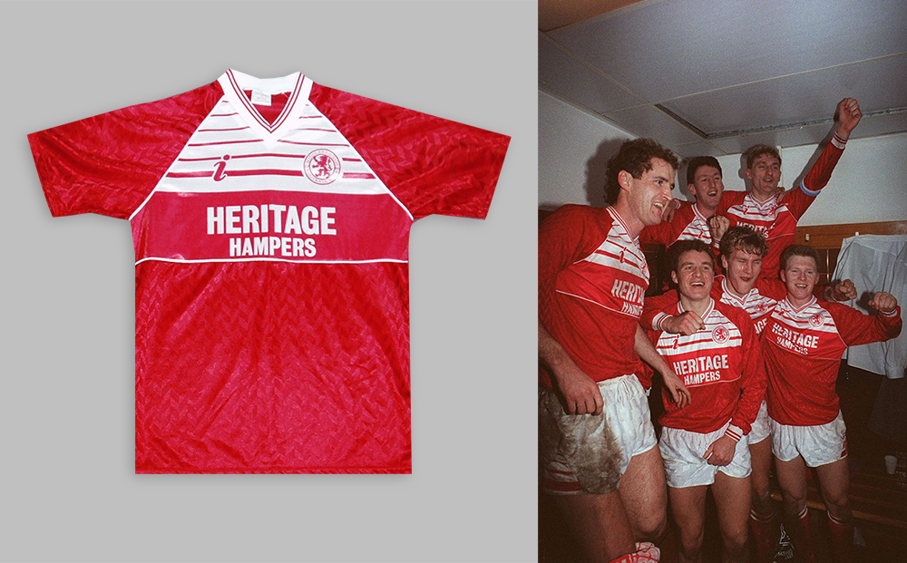
My first ever Boro shirt, how could I not include it?
Helped hugely by the fact it’s a real stunner.
Handed to me when I was about four by my dad, these were times when I didn’t know any better than to accept the fate that had been bestowed upon me.
Many years have passed since, 32 to be precise, and whilst I’ve often cursed my Boro-born father (I’m from Doncaster), ultimately the ups and downs and seemingly never-ending drama (not least the first 20 years of my time as a fan) mean I wouldn’t have had it any other way.
Little known Skill Leisurewear produced an updated take on their initial outing after replacing Hummel as kit maker. The lines across the chest (of which there were a few more) were no longer interrupted by a sponsor (Dickens replaced by Heritage Hampers), which now sat below within its own chest band. Skill’s logo also appeared. The simple ‘i’ made its debut, instead of the ‘MFC’ that had adorned the previous incarnation.
The subtle matt/sheen chevron type pattern made for a very classy top.
The shorts featured the same striped design of the shirt on either leg at the edges, with the socks being red with two white stripes at the top.
My fondness for the kit was only helped by the fact my first Boro hero, Stuart Ripley, could be seen bombing up and down the wing in it.
Middlesbrough 1994-95 Home Shirt by Errea
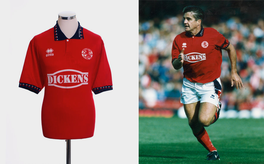
Middlesbrough’s first kit with Errea, fresh off the back of Chairman Steve Gibson’s new stadium announcement and the unveiling of Manchester United and England legend Bryan Robson, was further evidence of the club’s owner being willing to push the envelope.
Going with a kit maker in its relative infancy, it seemed like the Italian company and Boro were both in the early throes of something special, both individually and collectively, and so it proved. Errea’s partnership with Boro lasted 15 years, taking in some incredible moments.
The shirt itself was unique in that it featured the club’s crest, and local landmark the Transporter Bridge, with them both embossed within the shirts design. Proof from the ‘get go’ that this was a partnership that would work well, in the main, with shirt design, really resonating with those who’d be handing over their hard-earned cash to pay for one.
A full red shirt, though with a navy collar (which worked well surprisingly), went down a storm. The aforementioned detail, plus little touches on the collar and sleeves, made it a real head turner.
White shorts with red and blue detail were accompanied with red socks that featured navy trim at the top.
What was achieved that season, one that also signalled the end of Middlesbrough’s 92-year stay at Ayresome Park, certainly makes this kit even more beautiful.
Middlesbrough 1995-96 Away Shirt by Errea
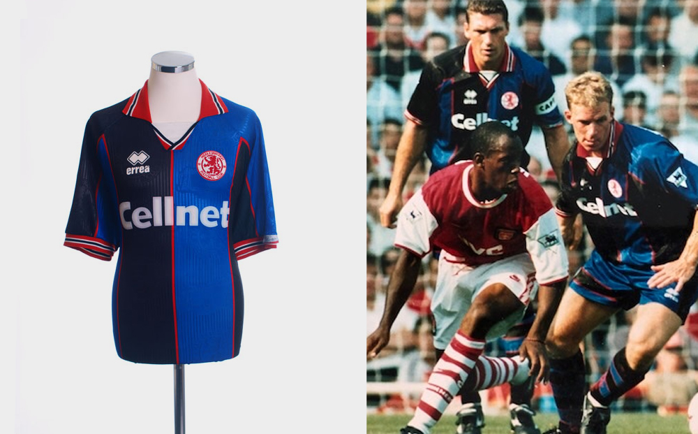
Memories of Jan Aage Fjortoft and Nick Barmby combining for the opening goal of our season, in the Super Sunday clash at Arsenal live on Sky, really set this kit apart from every other away kit we’ve ever had, for me.
As the sun shone brightly, Bryan Robson’s newly promoted side gave The Gunners a scare, before drawing 1-1 in a game that signalled Boro’s intentions – they weren’t in the top flight just to make up the numbers.
And the kit they wore that day was just as exciting.
Errea stuck with the embossed Transporter Bridge and Boro crest that had been so popular the season before in the home shirt. The colour scheme of black, red, blue and white sounds awfully busy, but the red and white were used sparingly, appearing on the collar and sleeve cuffs, whilst thin red stripes acted as buffers between the bold black and blue stripes that dominated proceedings.
To add to the excitement, a new shirt (and stadium) sponsor made its debut appearance. Gone were the local companies; in came the biggest communications company in the land – Cellnet. Boro were going places.
The shorts and socks carried on the colour scheme, thinner black stripes appeared on the shorts, one vertical the other horizontal on either leg, whilst the socks have to be, by far, the best ever worn by a Boro side - black and blue hoops, with that thin red stripe in between featuring once again, the bold look was a sure-fire winner.
I think the sands of time have reinforced the uniqueness of the kit, given we’ve not seen the like since (though many fans have called for Hummel, back as Boro kit suppliers, to put out their own twist on it).
The kit was only worn nine times throughout the 95/96 season too, further adding to the novel feeling of it.
Middlesbrough 1999-00 Home Shirt by Errea
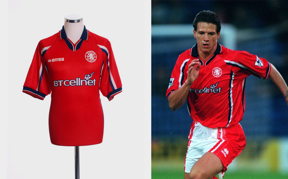
A shirt that really shouldn’t have worked, but for me it just did.
The presence of navy, a colour that had appeared in varying levels on home shirts since Errea’s opening offering in 1994, featured heavier than ever before.
A predominately navy collar with red and white piping, as well as sleeve edges following the same pattern, we were also treated to white and navy stripes running down from each armpit, along with the same on each sleeve.
Cellnet had become ‘BT Cellent’, and the updated logo (white font bordered by more navy) only served to make the shirt more attractive. Errea also went for a change to their previous logo design, choosing to place their name alongside the now famous two diamond shape, rather than underneath it (the only ever season to feature this, which is shame as it looked good).
The feel of the shirt was nice; the shiny material makes for a classy look, the only downside being it wasn’t very flexible meaning any size slightly small on you would provide no ‘give’.
My only real ‘beef’ with it, if you like, is the nonsensical decision to accompany it with the shorts from the previous season which simply did not match (white with red stripes). Whilst this doesn’t detract from the top, it does baffle me to this day.
One can only wonder how finer Christian Ziege would’ve looked with shorts that better complimented the gorgeous shirt he was wearing.
Middlesbrough 2016-17 Away Shirt by Adidas
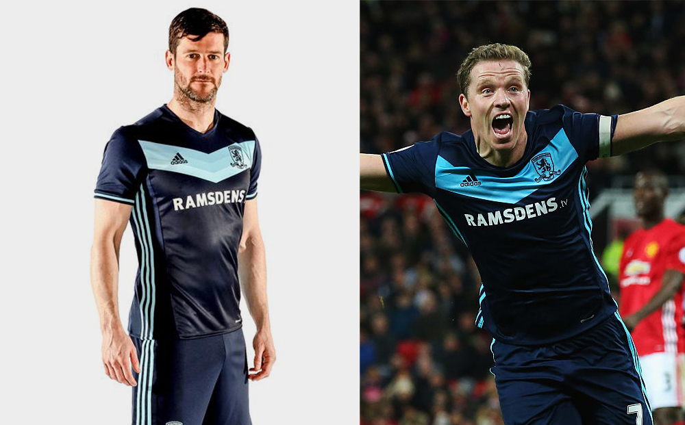
In Adidas’s near-ten years as kit supplier for Boro, I would argue their time was riddled with more ‘misses’ than ‘hits’.
A partnership that promised much more left us with barely a home top to get excited about, and just a handful of away/third shirts that hit the spot.
It wasn’t that the shirt designs were particularly bad (well, not all anyway), but it was more the unimaginative template stuff that failed to set pulses racing.
However among the small amount of quality away shirts, stood out, a modern-day classic.
The 2016/17 season was a car-crash in almost all aspects really. A long-awaited top flight return failed to hit the mark (much like the home shirt that season - think Aquafresh).
A rare anomaly though was the away kit.
The dark blue shirt, with contrasting light blue chevron, worked extremely well and looked classy on the likes of Alvaro Negredo and Christian Stuani (less so me).
The famous ‘Three Stripes’ ran from the armpit downwards, and the colour of them and the piping on the sleeves offered a subtle contrast to the darker tone of the shirt.
Another big plus is that it’s worn well, unlike some other Adidas offerings, and is my ‘go to’ shirt when I’m looking to sport Boro colours at my most casual moments.
Shorts and socks, very standard Adidas designs, kept with the same colours to round off a lovely looking kit.
Just a shame that it’s a constant reminder of a season of missed opportunities.
Words by Boro superfan Ian Smith. Ian has featured in the excellent Fly me To The Moon fanzine as well as Boro Mag.
Latest posts
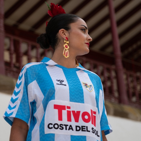
Malaga CF 2024 Hummel 120th Anniversary Shirt
In honor of Malaga CF's 120th anniversary, Hummel have introduced a special edition shirt,...
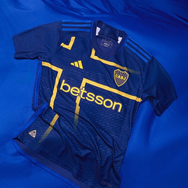
Boca Juniors 2024 Adidas Third Kit
Boca Juniors have released a new third kit, inspired by the Sweden flag which is how the historic club...
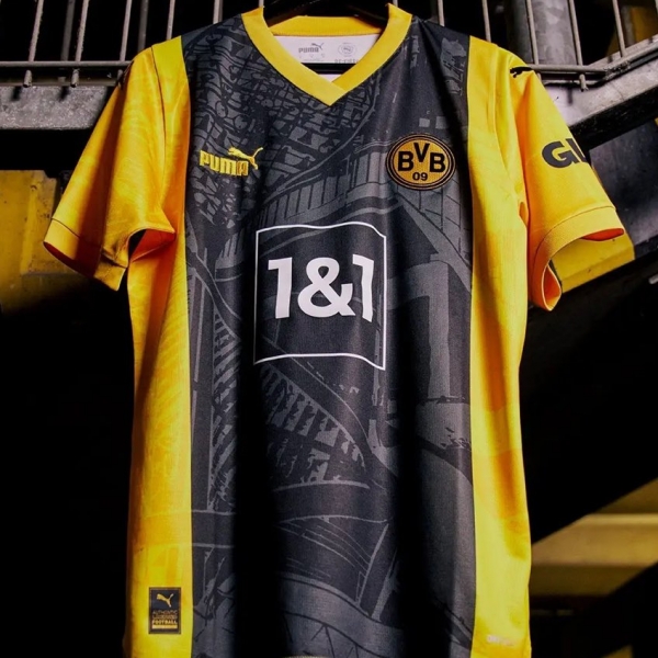
Dortmund 2024 '50 years of the Westfalenstadion' Shirt
To commemorate the 50th anniversary of the Westfalenstadion, Borussia Dortmund have unveiled a...
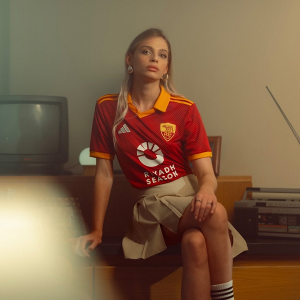
AS Roma Release Special 2024 Origins Jersey
Ahead of the 183rd Derby della Capitale, adidas has unveiled the AS Roma Origins Jersey, which...
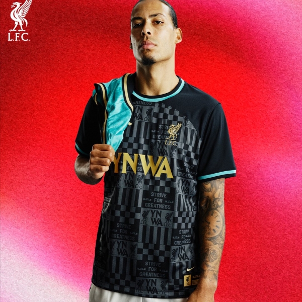
Liverpool FC x LeBron James 2024 capsule collection
Just over a year since its initial launch, Nike unveils the second chapter of the Liverpool FC...
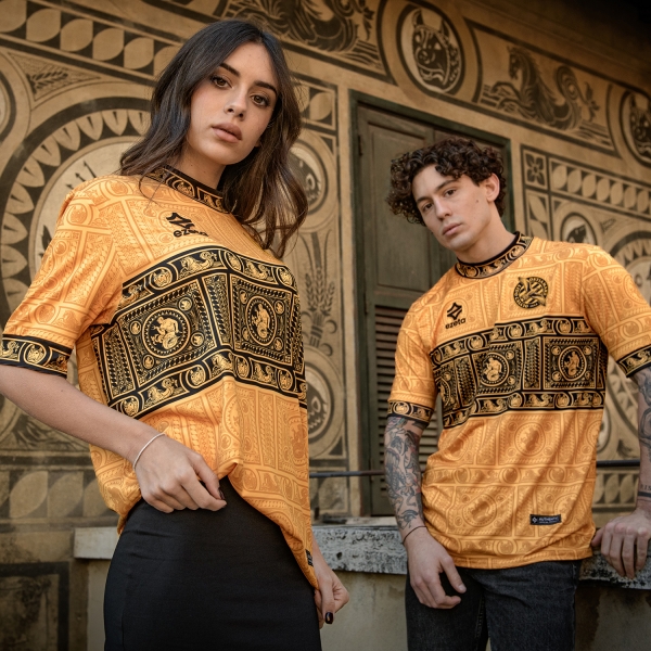
Kit Launch | AS Ostia Mare 2024 Shirts by Ezeta
AS Ostia Mare, a team competing in the Italian Serie D, has undergone a striking visual transformation...
Newsletter subscribe
Useful links
Customer service
Follow us